Wednesday, 17 December 2014

Digipak

Having decided that we wanted our digpak to centre around images of the wood, we began to construct the four panels. We wanted the front cover to involve a striking image of the 'front man' of the band, and the name 'Carter James' in larger lettering. Having used a particular font on the website, we decided to replicate it on the album so that the two are close to identical. We hope that this would draw a link between the two products and make them recognisable to consumers. As the main thematic element of the digipak centered around the woods, we decided to incorporate this on the back of the digipak and on the CD page as well. To do this, we zoomed in and cut out pieces of the woods from the centre image, thus they all have the same colour palette. This establishes a link between the panels and adds to the bands authenticity, and organic star image.
Here is the images that we hope to use:


This is to be the front image of the digipak. We still need to adjust the text, so that it is more in the centre but apart from that, we are happy with this as a front cover image.


This is to be the back panel of the digipak. We made up some other song names in order to make the digipak look more realistic, and we used the same font and colour scheme as on the front. We still need to add a bar code and the labels image to the back cover, as only then will it look really realistic.


This is to be the image underneath the CD, thus we did not want it to be overly exciting. As a result, we decided to continue the theme of the woods by having a stylistic image of fallen trees. As this image will be partially obscured by the CD, we did not want to add any text to this image, as it would only be lost.
Having decided three of the panels, we began to brainstorm ideas for the inside cover. Some members of the group argued for another image of the 'front man', but I argued against this, as I felt that we needed to incorporate the other band members as well. As a result, we came to the decision that we would take four headshots of the band members and put them in the front cover, thus signalling that it was not just a sole artist work, but a collaboration of people.

Tuesday, 16 December 2014

Website Elements: Front Picture - Lightbulb

Having completed the majority of the pages on the website, we began to concentrate on the front page, as this would be the most important. We wanted the website to be instantly striking and convey the bands star image, thus we began to research images of interesting light bulb photography. Here is some images that we took for inspiration:


We really liked the sharpness of these images, thus we knew that we wanted a close up of a single bulb as the image of our front cover. Having decided this, we began to brainstorm ideas of incorporating both thematic elements together in one image. Therefore, we decided to play around with an  an image of a light bulb and  a tree, and then photo shop the tree into the light bulb. We hoped that this would provide an enticing image that would immediately drawn in the audience. Here is some of the images we are looking at merging together:


This is the final front picture that we got:


For the background for the rest of our website, we chose an image of multiple light bulbs and recreated it, so that we had a variety of light bulbs hanging from the ceiling. We decided to keep the website in black and white as it made it look more clean and professional, and added to the 'mysterious' star image of the band.

Monday, 15 December 2014

Website Elements: Merchandise

We looked at various real artists merchandise pages as inspiration for our own.


We realised that T-Shirts were the main product that artists used, as there are multiple combinations that can be used to promote the artist. As a result, we decided to create one t-shirt with the name 'Carter James' on and then one with the name and an image. Additionally, we created a hoodie and cap, in black and white, with the name 'Carter James' on. We used the same font for each in order to establish a link between the products. We decided to stick with the colours black and white, as they matched the bands star image and linked with the websites colour scheme.

We used Vistaprint to create the merchandise, and then created a store on the website.
http://www.vistaprint.co.uk/?GP=2%2f7%2f2015+2%3a25%3a31+PM&GPS=3425795771&GNF=1

Here is the merchandise we created:


Sunday, 14 December 2014

Website Elements: Social Media

We wanted our website to be accessible to our target demographic (males aged 17-25), thus we wanted to involve other social media websites where we could promote the band. Having done some basic research, we knew that Facebook, Twitter and YouTube were the mostly widely used by our target audience, thus we set about creating pages for our band. We created a 'Carter James' Facebook and Twitter page, and then linked them to the website. We used the same images and colour palette, thus ensuring that the 3 websites were connected together. As a result, we combined images of the woods and light-bulbs in order to emphasize these thematic elements. In the bio sections, we used information similar to the details on the ABOUT page, thus we began to build up the bands star image and promotional campaign. We connected the YouTube page to the video, so that when you click on it, the video immediately begins to play. Again this was about building up a promotional campaign for the band. In relation to this, we created a SIGN UP page for the website, so that we could gain 'feedback' or 'fan mail' from potential audiences. To do this we created a Gmail account for the band and added it as a footer to every page of the website. We hoped that this would encourage audiences to become involved with the artist and thus benefit promotion.


Saturday, 13 December 2014

Development of the Website and Digi-Pak

Having done our initial brainstorming session, we began to develop our ideas for the website and digi-pak. We knew that we wanted to centre the two products around the images of woods and light-bulbs, thus we began to channel our creativity into incorporating these themes into an actual product.

Firstly, we undertook a photo shoot with the lead singer, as although we had taken a lot of photos on the shoot day, we needed more images for the website. Equally, we wanted these images to focus solely on the lead singer, in order to emphasise the image of him as the front man. We chose to locate the photo shoot in the woods around our school, thus they were easily accessibly but provided a variety of interesting shots. Here are a few that we particularly liked:


Having done the photo shoot, we decided that we wanted to use the images of the lead singer in the woods on the digi-pak, as establishes a mental image in potential consumers minds. We wanted to promote the lead singer on the digi-pak, but the band on the website, therefore we decided to use  the theme of the woods on the digi-pak and the light-bulb theme on the website. This would provide a distinction between the products, but ensure that they were still linked to the video. Yet, we uploaded all the pictures we had onto the GALLERY page of our website, as we wanted the website to look authentic and professional, thus wanted to use a variety of photos. We edited the images carefully before we uploaded them, as we wanted them to be sharp and clear, but of more muted colours, as we decided that our colour palette would involve, blues, greys, blacks and whites. This links with the colour palette of our video, thus we were creating a link between the three products.

Having created the GALLERY paged, we focused on the ABOUT page of the website. We looked at similar artists websites, such as The Script, Elbow and Kodaline for inspiration, as we wanted to know what generic information we should provide. Thus, we centred the ABOUT page around where the band comes from, and introduced the lead singer as the front man and then the rest of the band members. We did not want the text to be too long, as audiences would lose interest, thus we created a concise summary that explained the bands background. We also decided that this would be a good page to portray the video, thus we embedded it into the website so that when someone clicked on the ABOUT page, the video automatically began to play. This is a good way to promote the band, as it forces the audience into watching the video without them being aware of the advertising.

We then focused on the TOUR page of our website, as we needed to create a variety of locations where our band would play. We researched various venues that coincided with the star image of the band and then added them to the website. We linked the website with Ticketmaster, as we decided that they were a suitable site that would sell tickets.

Thursday, 4 December 2014

Performance Cut + Feedback


  We have finally finished the rough performance cut of our music video. We are going to have another element in the video, which we have also edited, but it needs more work. So we showed performance cut to our class in order to get some feedback.

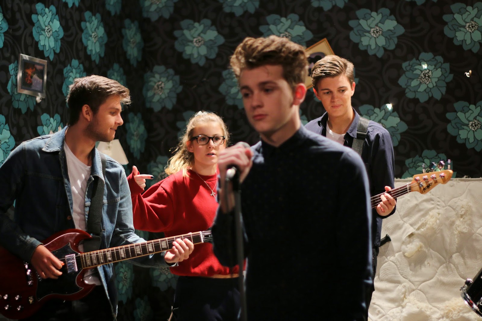
And surprisingly, it was rather positive. Our classmates noted that editing, overall, was very good: there is an appropriate build up to the climax of the video, so that although it is only a band playing on a single set, it is exciting to watch and it keeps attention till the end. The atmosphere is well-created as well, mostly due to camera work and especially hand-held shots. And also the concept that we wanted to convey such as that this is a room after a huge fight, is rather clear. It feels like a band performing, not a single artist, although our lead singer, Harry Lawtey, is impeccable! The performance of our drummer, Tom Saville, was appraised as well.

However, obviously, there are some flaws. Some hand-held shots in the beginning of the video seem a little out of place since there is supposed to be a build up to the chorus line, and it is then when we include these shots. Some shots of our guitarists are a little weird, and it is easily noticeable. In some places there is not enough attitude and drive from our guitarists, but overall, they were very good as well.

So the suggestions for our video include a removal of hand-held shots from the first verse and just get on with the second part of the video.

This preview seemed very encouraging to me and, hopefully, our second element will add something new to the video and refine it rather than spoil what we have got so far. I’m looking forward for the final product. 

Sunday, 23 November 2014

The Editing Process

Having filmed our performance element, we began to create a rough cut of our video. This will be really useful once we have filmed the narrative element, as it will be far easier to incorporate the other footage if we already have a video to work with. We first familiarised ourselves again with Adobe Premier Pro, and then began to synch each clip to the song. This involved linking the right time sequence that appeared on the clapper board, with the right moment in the song, so that the clip would always be in time. This was a long process as we have numerous clips, but will be ensure that our video looks right, as the singers lip syncing will only look realistic if it is in time. As we synched each clip, we renamed it, so that when we came to properly editing, we would know exactly which shot was which.

Having synched each shot, and removed the audio for each clip and replaced it with the track, we began to edit the clips together. We worked in 10 seconds chunks, so that we were not overwhelmed with the amount of shots we would have to piece together. As the beginning was the most important part, we decided to leave it until the end, so that when we had finished it would be easier to introduce the video with the right shots.

Our group decided to work in pairs, so that one pair would work on editing whilst the other would work on the website and album. This meant that we all had a go at editing, but also were involved with the creative tasks of constructing a proper band website and album.

Saturday, 22 November 2014

Evaluation of the Shoot Day #2

For the second shoot day, we went to Kate's house to film an action sequence in the woods. We took several guns and fire-grenades. This was meant to be a huge battle. AS we arrived we walked around the woods looking for locations we could use. Then we created a brief outline of our action sequence and started to film.

Since while filming the performance, I was operating the camera almost all the time, we decided to divide the roles in the different way this time, so that girls were on camera most of the time. I also had a camera in my hands, but I was taking stills for our ancillary tasks.

Finally, we used almost all of the guns we brought with us and fired three fire grenades. It was a lot of fun!! We managed to finish the whole sequence before lunch and everyone was pretty happy with the result. Now we can focus on post-production. Hopefully, the final video is great! Looking forward to it!


Friday, 21 November 2014

Evaluation of the Shoot Day


The day before the shoot was very nervous. We were busy arr4aging everything for the shoot, however, it still felt to me that we were not prepare. We quickly sketched our schedule for shooting on location, it made me feel a little better, but I still wasn’t sure how it would. This evening we conducted a rehearsal with our band, which I was really satisfied with. Each of them was genuinely engaged in the process. Next thing we did was that we started building a set, namely, attaching wallpapers to the walls and bringing props that we needed for our shoot in the studio. And, to my surprise, it was rather exciting. However, we had to leave before the set was built completely. Nevertheless, next day as soon as we entered the studio we were ready to shoot, thanks to our amazing set designer, T.A.

Due to a necessary change in our idea two weeks before, we didn't have enough time to work through all the details of our concept, but I think what we finally had got was just amazing. Ripped wallpapers, feathers lying everywhere, a knife in a mattress etc. I guess it was pretty close to what we intended it to look like.
However, our shoot hasn't started until after lunch since there was a gas leakage in the studio. And because of this predicament, we decided that we shot the other bit bit of our music video which is supposed to happen in the forest, but then again we didn't go to Kate's house as we initially planned and went to look for locations nearby school...
But we didn't find anything good enough... Thus it was only after lunch when the smell of gas in the studio dissipated and we were able to start shooting. By that time I felt reasonably discouraged and wished that the filmed another day since it seemed like everything was going wrong.
Nevertheless, we got our band into the studio immediately after lunch and started shooting. I was given a role of camera operator and director of photography to some extent...

Melissa was taking stills.
Megan was on a slate. 
And Kate was directing.

And I think all of us did pretty well on our roles. We didn't have a lot of time to shoot, but managed to get all the shots almost in time and on quite a high level. I thought some of the shots that I have proposed were quite beautiful and reflected our concept at the same time, and I'm sure that eventually our video has a potential to become really good. There were several shots in particular which I really liked and I proud I have made them. 
 
However, it was pleasing that we worked cooperatively with our group, so the shoot went pretty quick and smooth,
although the beginning of this day didn't presage anything like it. Generally, we almost didn't have problems during the shoot. There were several Wide shots where we had problems with the strap of our base guitarist, but merely substituted it and filmed a couple more takes.


So I was very happy with the way the shoot went, although I think the most fun part of the shoot was when we filmed CUs and ECUs of our lead singer since the framing and the lighting was brilliant and he is an impeccable performer. I also got to operate the camera during the take, which I didn't have a chance to do during the rest of the shoot. It was tense, but overwhelmingly exciting.


I don't think there were any major flaws with our shoot. The only part I wish had gone better was the first part of the day, when were simply wasting out time and keeping our band waiting. That was very frustrating.
However, still I really enjoyed filming. We probably wouldn't get that standard of material if we were in a different mood and I think we managed everything pretty well. As I already said the group was working very cooperatively we were trying not to lose a lot of time, which we quite succeeded in.

And now, obviously, we need to make a lot of changes to our website and artwork, in fact, completely redo them, start anew. But, to be fair, I enjoy this idea and song (oh, song is just fabulous!!) much more than enjoyed the previous one, so it's a great pleasure for me to work on this project and I'm looking forward for the final product!


Friday, 14 November 2014

The Website Artwork

As we began to edit the video, we started work on the website as well. We researched bands with a similar star image in order to gain inspiration for our own website. We really liked the black and white theme that The 1975 uses in their website, and how the front page is a mixture of striking images. However, we equally liked the bold image on The Scripts opening webpage. We noticed how both bands had their name in big letters in the opening page, and how it was in the same place on all the other pages as well. We compared the different sub pages of artists webpages, and came to the conclusion that we needed to involve an ABOUT, GALLERY, MERCHANDISE, TOUR pages, as these were all communally featured. 


Having done some initial research, we decided that we wanted to have a bold image on the front page of website, in order to entice potential consumers. We therefore began to think of a symbol that embodied the nature of the band, and one that we could use to link our three products together. Having discussed our options, we decided that the two key thematic elements of the video were the 'woods' and the 'light-bulb'. Both these elements reflect the star image of the band, as the woods link with the 'rebellious' and 'bad-boy' image we want our front man to embody, and the 'light-bulb' represents the authenticity of the band. As a result, we decided that we would use these two themes in the website and digi-pak in order to establish a link between our three products, that an audience could identify with. Therefore, we decided to do a photo shoot of the lead singer, as we wanted to picture him in the woods so that we could develop this thematic element. Equally, we began to play around with images of trees in light bulbs, as we though this would be a striking image for the front cover of the website.

Wednesday, 5 November 2014

Copyright Permission "Grounds for Divorce"


To Fiction Records, Charlotte Thomas

We are a group of A Level students working on an A Level project for a qualification in Media Studies. We are writing to request permission to use the following track as part of this project:

Elbow – Grounds for Divorce

With your permission the track would be used as the accompaniment to a short form video that is made purely for assessment purposes and will have no commercial usage. The video will be viewed only by members of the school community and the assessor of the examination board.

The artist and the copyright holder will of course be fully recognised in the pre-production and evaluation material that accompanies the project. We can also include a full copyright notice if required both in the planning material and on the video itself.

Yours sincerely


Archie Repin, Kate Douetil, Megan Havard, Melissa Maden
Hurtwood House School